2024
Realtor.com
Optimizing search filters on Realtor.com
Overview
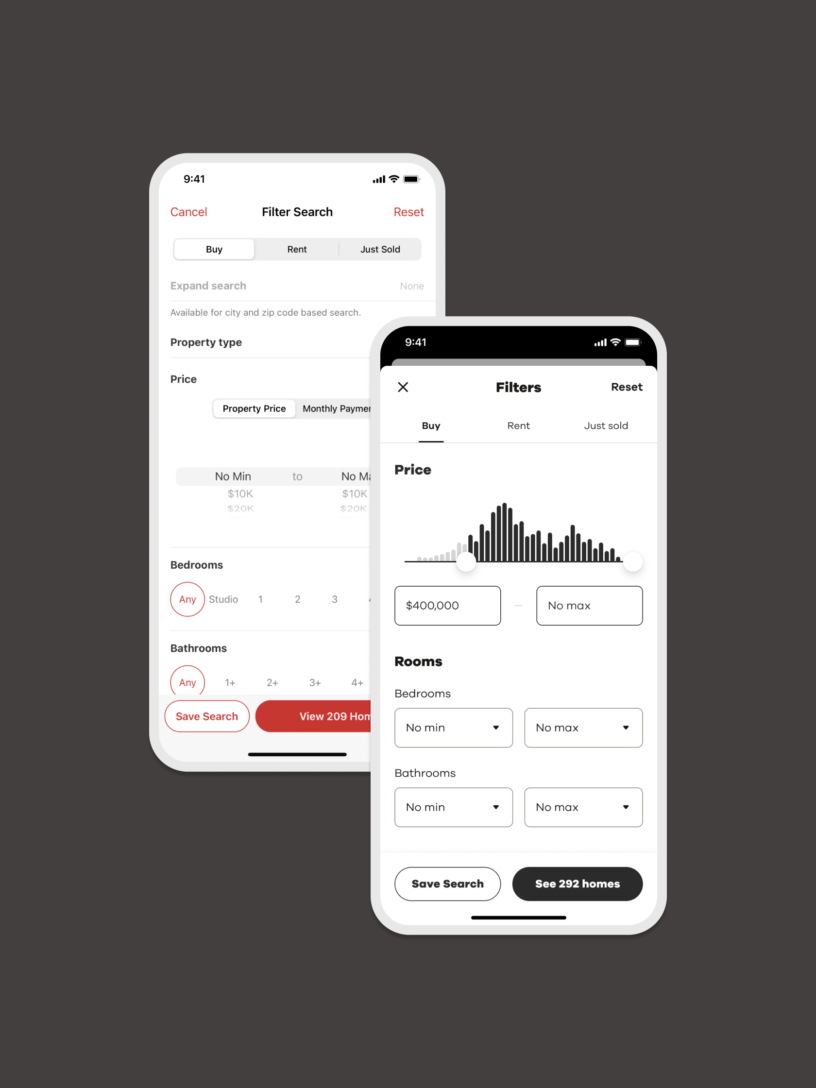
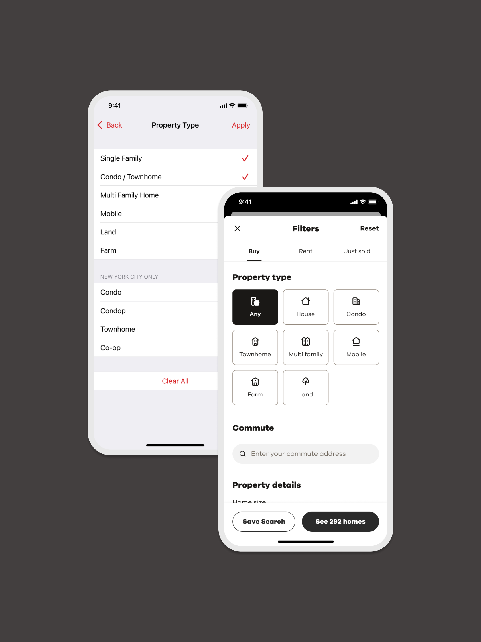
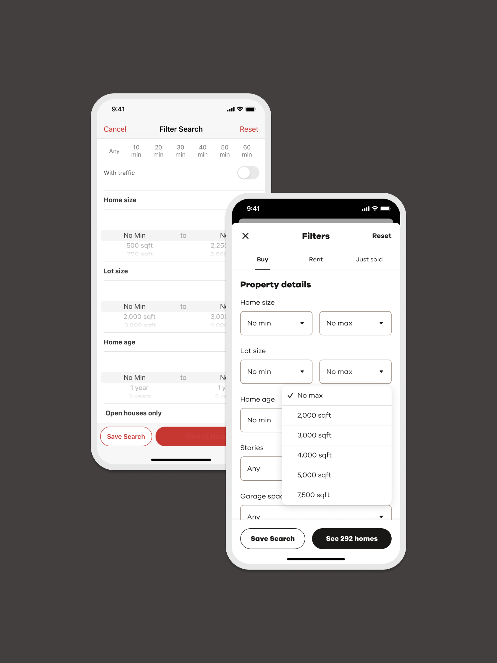
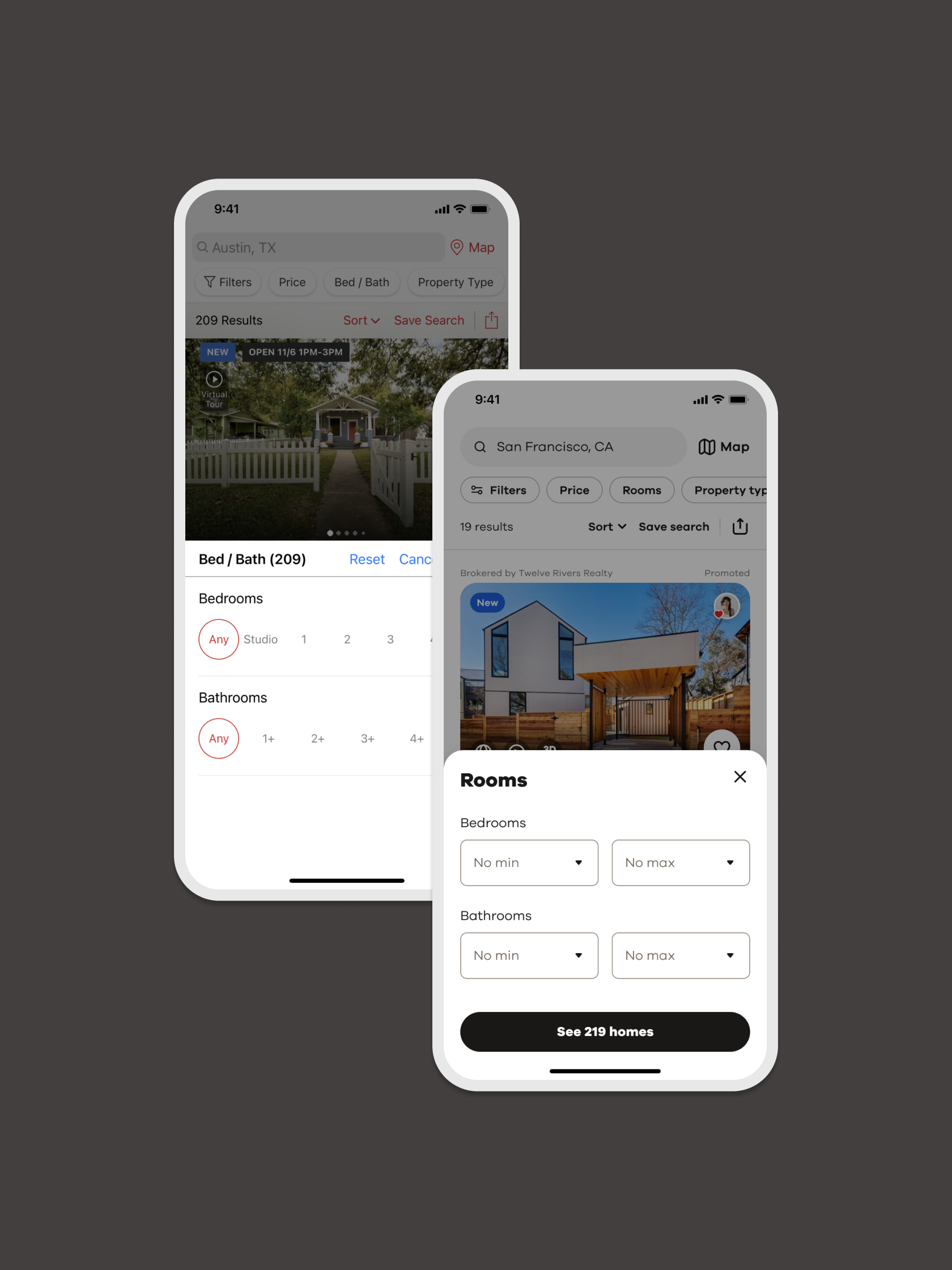
Creating a seamless and consistent search experience across platforms is vital for fostering user trust and satisfaction. At Realtor.com, discrepancies in filter implementation between web and mobile led to fragmented experiences, negatively affecting users’ ability to find relevant properties efficiently. Key challenges included missing filters, inconsistencies in user experience and interface design, and a lack of standardized taxonomy. These issues often resulted in user frustration, confusion, and critical feedback in app reviews.
To address these challenges, I led a comprehensive redesign initiative to unify the search filter experience across all platforms. Through detailed UX audits, user research, and iterative testing, we standardized the filter taxonomy, resolved inconsistencies, and created a cohesive design system. This effort aimed to enhance usability, drive user engagement, and improve Customer Satisfaction scores.
MY ROLE
Design lead
MY SKILLS
User Research
User Testing
Prototyping
Competitive Analysis
Information Architecture
Content Strategy
UI / UX Design
Hypothesis
By creating a standardized, cross-platform search experience, we will reduce user friction, improve usability, and eliminate errors across platforms. This unified approach will boost engagement, retention, and user satisfaction by ensuring reliable access to searches and preferences on any platform.
Success Metrics:
Higher filter usage rates across platforms
Improved user satisfaction scores (CSAT)
Reduced negative feedback and saved search errors
Problem
The Realtor.com experience suffered from inconsistencies between platforms, leading to invalid searches and saved search errors when users transitioned between app, web, and marketing notifications. This fragmented experience created frustration and drove up customer service inquiries and negative app store feedback, underscoring the need for a seamless, consistent, and reliable cross-platform search solution.
34%
Users reported being unable to locate specific filters they expected to find
45%
Users expressed dissatisfaction with the organization of existing filters
Platform Audit
The first step in the process was conducting a detailed platform-wide audit to identify inconsistencies and gaps in the filter experience. This analysis uncovered significant issues, such as missing filters like “Furnished” and “Energy Efficient,” and discrepancies in the placement and taxonomy of existing filters. For example, the “Garage” filter appeared under different categories across web and mobile platforms, confusing users. The audit also documented overlapping terms, such as “Property Details” and “Property Features,” further contributing to usability challenges. These findings became the foundation for a unified and consistent filter taxonomy.
Consumer Pain Points
Through user feedback and behavioral analysis, several recurring themes emerged. Users expressed frustration with the lack of cross-platform consistency and the difficulty of finding critical filters. They frequently requested additional options, such as school districts and multi-city search, to better tailor their results. The overwhelming number of filters, coupled with poor organization, made navigation cumbersome. Additionally, ambiguous terms like “Days on Realtor.com” led to misunderstandings about functionality. These insights shaped the project’s primary goals of improving usability and addressing unmet needs.
Feedback & Insights
After compiling findings and working with engineering to validate technical inconsistencies, I conducted a competitive analysis to benchmark best practices. I collaborated with a content strategist to refine filter taxonomy and naming conventions. This informed the creation of a new information architecture, which I validated through card-sorting exercises to ensure alignment with users’ mental models. These efforts guided iterative refinements to the filter design.
User testing confirmed that users valued the clear and organized structure, particularly for critical filters like price, bedrooms, and property type. However, feedback also highlighted the need to balance the breadth of filter options with simplicity, ensuring the interface remained approachable and easy to navigate.
Impact
The redesigned filter experience significantly improved user satisfaction and platform engagement. The project eliminated long-standing inconsistencies that frustrated users by aligning filter functionality and taxonomy across web and mobile platforms. Introducing a clearer, more intuitive filter structure simplified navigation, allowing users to find what they needed more efficiently. Additionally, enhanced usability reduced filter-related complaints and fostered deeper engagement with the platform.
85%
Users found the redesigned filter structure intuitive and easy to navigate.
15%
Increase in CSAT scores after implementing the new filter experience.
Reflections
This project highlighted the value of iteration, with repeated testing and refinement ensuring that user needs remained at the center of the solution. Collaboration across teams was essential to the project’s success, as strong partnerships with product, engineering, and QA enabled smooth execution and alignment on priorities.
The importance of consistency was a key takeaway, as a unified experience across platforms not only improved usability but also strengthened user trust and loyalty. By focusing on the most critical pain points, the redesign delivered meaningful and impactful results quickly, setting a strong foundation for future enhancements.


